Campaign Details Charts
Charts
Sites Chart
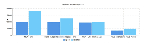
The Sites Chart shows Spend and Revenue side-by-side for sites (that have received clicks) over the time frame selected in the filter. Spend and Revenue.
Common Uses:
A visual representation of site performance over the days filtered. The scale of the Y-Axis Spend allows you to quickly see what spend vs. revenue is like for an individual site as well as comparing 2 or more sites together. You can use it to answer questions like:
- Where has this campaign been spending the most?
- Should I make changes to site bids by updating the site CPC?
Clicks/Conversions Chart
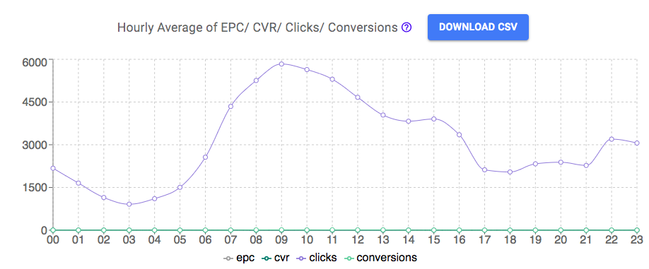
The Clicks/Conversions Chart displays the Hourly Average of EPC, CVR, Clicks, and Conversions for the time frame selected. Hovering over the chart will show you the hourly average across those days selected. Hovering over the chart will also display the Profit % hourly average. Click Download CSV to export a report of the chart. Data in the report will be the data based on the selected time frame.
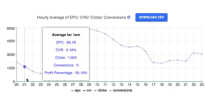
Common Uses:
The Clicks/Conversions Chart is used well in conjunction with Day Parting - by viewing campaign performance on an average for different hours in the day, you can decide to limit CPC or pause the campaign entirely during low EPC or low click periods throughout the day. Using this chart also helps in making evaluations of how well the campaign is doing throughout the day to assist in making optimization decisions like removing images or how to run similar campaigns.
EPC Chart
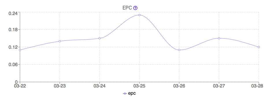
The EPC Chart displays the EPC over the time frame selected. Using multiple dates lets you see the trend of EPC throughout those days. You can also hover over these points to see the exact EPC for that specific day.
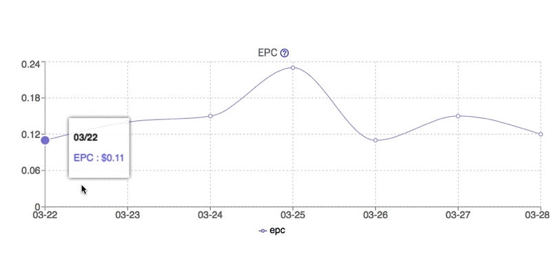
Common Uses:
The trend of earnings per click over multiple days shows how the ads in the campaign are performing across these days. The higher the EPC the better the images are doing on that day. It may be useful to utilize Day Parting to pause campaigns on days that are getting a lower EPC than others. Remember to look over multiple periods of time to get a clear idea, sometimes campaigns don't do well one day, but the same day last week they were great. Keep in mind what ads were running during these times as well.
Hourly Clicks Chart
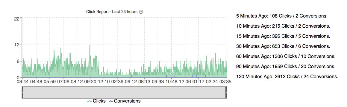
The Hourly Clicks Chart gives a detailed look at the Clicks and Conversions for the Last 24 Hours. On the right side, there is a breakdown of the number of Clicks and Conversions that has happened in the last 5, 10, 15, 30, 60, 90, and 120 minutes. You can hover over the chart to see the exact clicks and conversions at that time. There is a separate bar on the bottom you can adjust to view specific time frames, and you can also drag this bar to view that amount of time over the past 24 hours. The Y-axis will automatically change based on the amount of clicks seen.
Common Uses:
The minute breakdown of clicks on the right of the chart is an easy way to see recent campaign performance during the last 2 hours. The detailed graph of clicks and conversions, adjustable over a time frame with the bottom bar and dragging the bar over the last 24 hours, lets you see a visual representation of clicks that can be quickly evaluated.
Hourly Comparison Chart
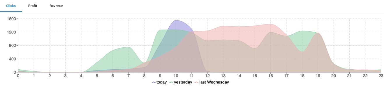
The Hourly Comparison Chart displays hourly averages of data from Today, Yesterday, and One Week Ago from Today on the same graph for comparison. Use the tab selections at the top to choose between displaying Clicks, Profit, or Revenue. You can hover over this chart to show the exact numbers for the three data days displayed.
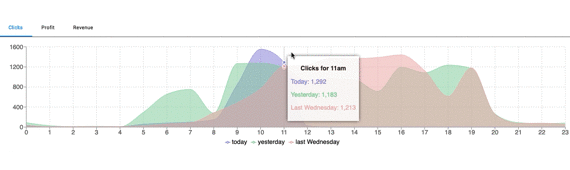
Common Uses:
Use this chart to compare between the data for yesterday and today for an easy to reference look into recent performance. By looking at the same day last week you can evaluate how your campaign has been performing a week ago versus today. If there's a decrease in clicks or revenue you can begin looking at what may have caused these differences to make adjustments. If your campaign is performing well, see the growth in hourly averages to view how well it is scaling, and if it is not meeting your expectations you can adjust to get more performance.
Weekly Comparison Chart
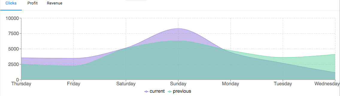
The Weekly Comparison Chart displays data from the Current day and the same day from One Week Prior for a weekly comparison. The data can be changed to view the Clicks, Profit, or Revenue. Hovering over this chart shows the data for the two days.
Common Uses:
Use this chart to compare the data from this week and last week. If there’s a decrease in clicks or revenue you can begin looking at what may have caused these differences to make adjustments. If your campaign is performing well, see the growth over the past few days to see how well it is scaling, and if it is not meeting your expectations you can make adjustments to get your campaign to where you want it to be! To take a better look into the data, try setting the date filter to the Last 7 days for a closer look, and take advantage of the Campaign Log to see what changes you were making previously to help improve your campaign